

- health
- Agency
Same shelf. Different eyes.
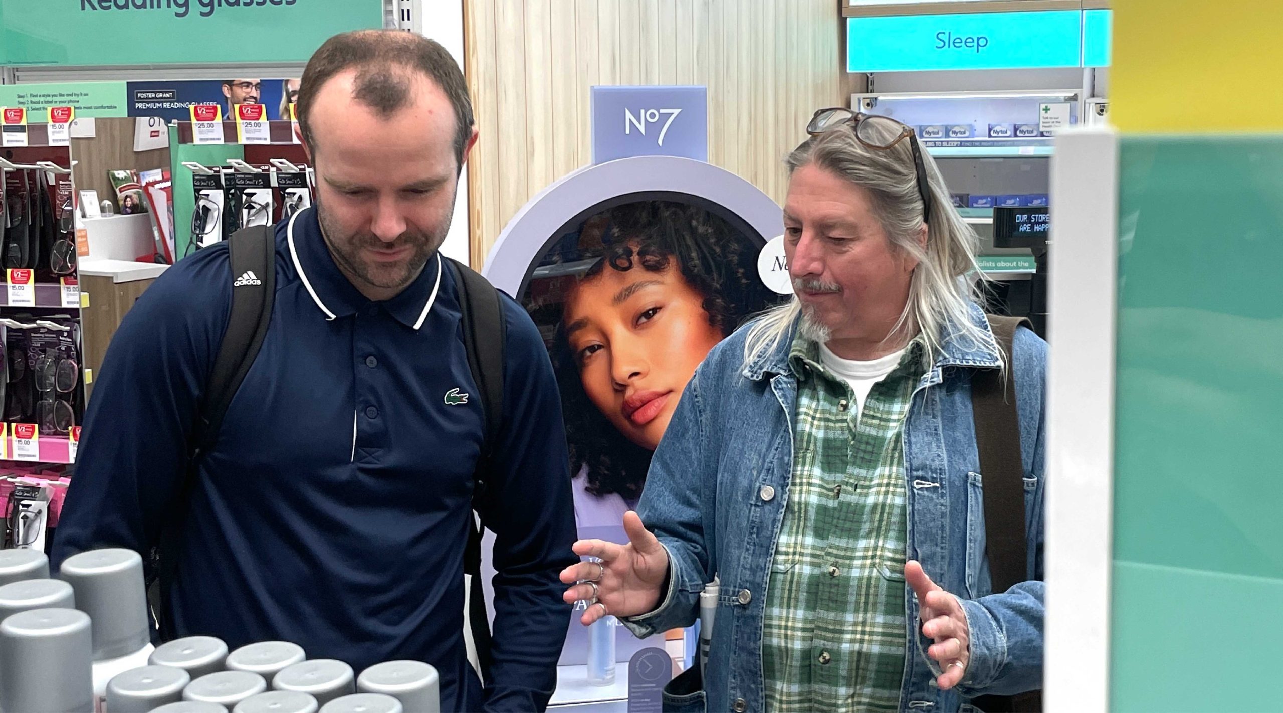
We all walked the same aisles. We didn’t all see the same thing.
On our latest pack tour, strategy spotted one challenge, design another, commercial saw a different risk again and that’s exactly the point. The shelf is where brand, behaviour, creativity and commercial reality collide, and looking at it through one lens only tells you part of the story.
We’ve pulled together what caught each of our eyes from packaging and POS to navigation, innovation and changing category cues.
WHAT CAUGHT OUR DESIGNER’S EYE
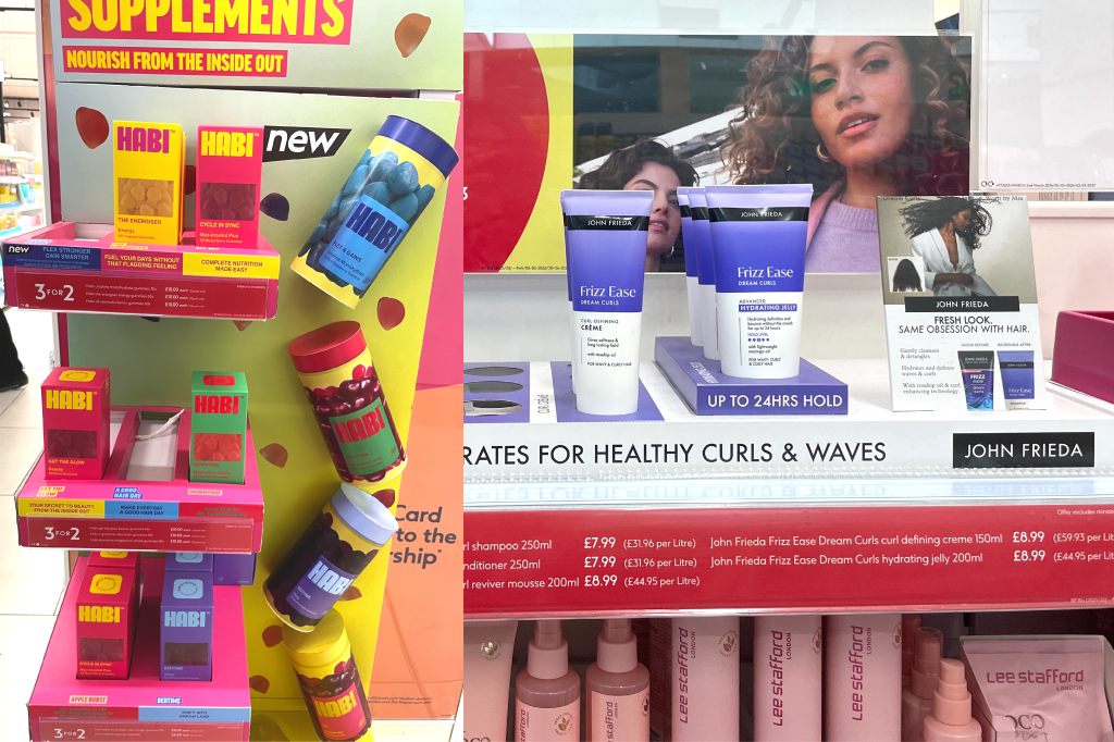
The shelf doesn’t have to tell the whole story.
Habi’s bold, stripped-back pack and POS suggest the education may be happening before shoppers arrive through TikTok, influencers, search and social.
WHAT CAUGHT OUR COMMERCIAL DIRECTORS’S EYE
Your most loyal shoppers shouldn’t have to rediscover you.
When familiar packaging changes dramatically, POS has to bridge old and new, helping loyal shoppers still recognise the brand they know and trust.
WHAT CAUGHT OUR MARKETER’S EYE
When wellness starts looking like sweets, where should we draw the line?
Playfulness can open the door to wellness. But when products have real physiological effects, disruption should never come at the expense of trust.
WHAT CAUGHT OUR STRATEGIST’S EYE
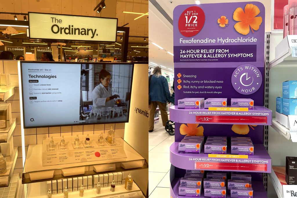
Innovation that adds complexity isn’t progress.
Interactive POS has huge potential, but when information overwhelms shoppers, it becomes another barrier to confident decision-making
WHAT CAUGHT OUR DESIGN DIRECTOR’S EYE
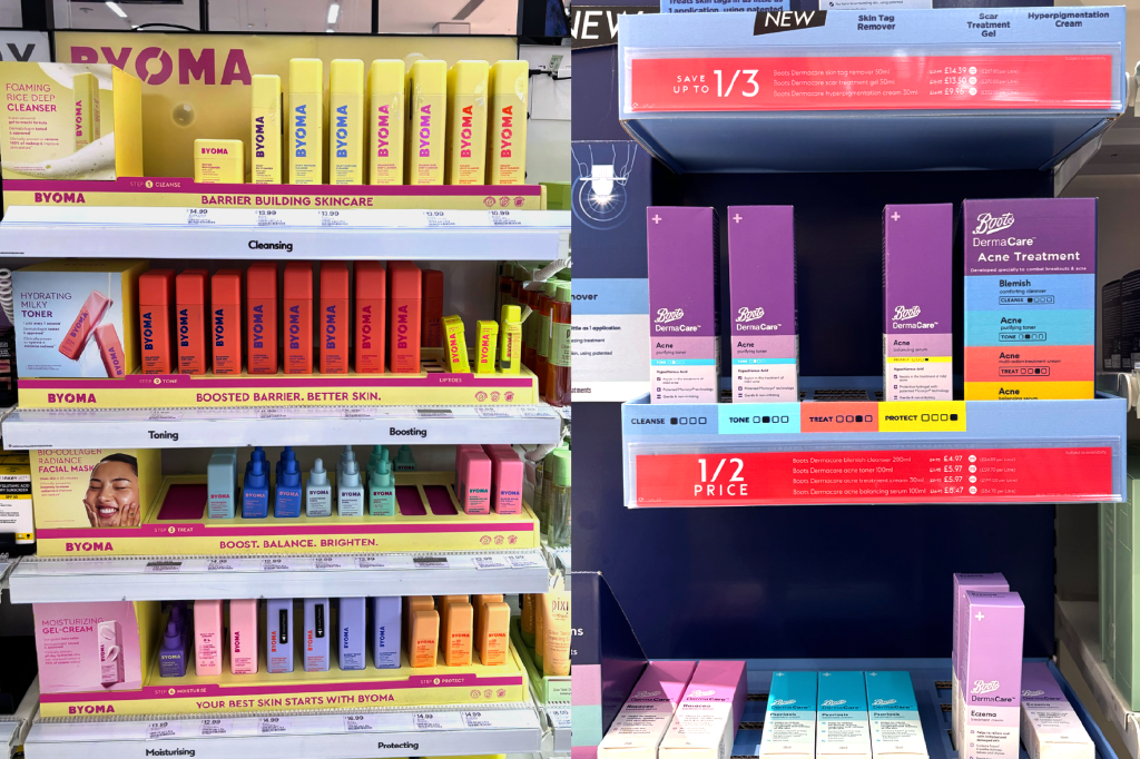
The shelf is where brand design meets decision-making.
The most effective brands carry pack architecture, signposting and messaging into the retail environment, making products easier to find, understand and choose.
WHAT CAUGHT OUR CLIENT DIRECTORS’S EYE
The best packaging doesn’t just stand out. It drives preference.
Clear need states, colour coding and consistent architecture turn a complex range into something shoppers can navigate in seconds.
WHAT CAUGHT OUR DESIGNER’S EYE
A colour can look distinctive in the boardroom and disappear on shelf
In categories like sun care, the obvious colour territories are already crowded. True distinction only becomes clear when your brand is viewed in the context where shoppers actually make decisions.
WHAT CAUGHT OUR PROJECT MANAGER’S EYE
You need to win attention before you win understanding
HABI and Weleda showed how repeated shapes, bold colour blocks and clear structure create a shelf presence shoppers register before they get into the detail.
WHAT CAUGHT OUR ART WORKER’S EYE
Simplicity still needs a strong idea
Reducing clutter can increase impact, but only when there’s a strong idea at the heart of the execution.
The biggest opportunities can sit in your blind spots
Strategy, insight, creative, design and implementation each see something different. Together, they uncover opportunities a single perspective can miss.
Whatever stage you’re at, bring us in. We might see what you’re missing.
Back


