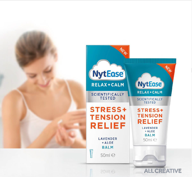
Extending a brand and carving out a new wellness category
Problem
Nytol, the UK’s No. 1 sleep aid brand, has been helping people get a better night’s sleep for over 20 years. As a part of its commitment to providing round-the-clock sleep and stress support, the Perrigo-owned brand wanted to expand its portfolio into the stress and relaxation space with the launch of new Nytease.
This posed three distinct challenges:
+ How to leverage the Nytol brand beyond its sleep franchise into a broader wellness and day as well as nightime benefit
+ How to stretch a brand with P line status into a food supplement – with all the regulatory issues that that brings
+ How to build a credible stress range that brings clarity to this nascent and ill-defined category.
Strategic approach
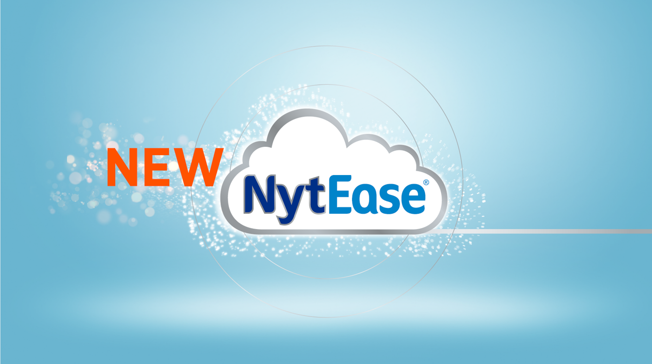
Our approach was to define a branding solution that would optimise and enable stretch of the Nytol equity, reflect the needs of the stress category and address regulatory concerns. After thorough market analysis, positioning research, naming generation and considering various packaging possibilities, a sub-brand called Nytease was born.
We needed to differentiate Nytease from other purely herbal stress relief products and leverage the fact that Nytease had a unique proposition, being scientifically-proven as well as containing only natural ingredients.
We also needed to engage a diverse audience and acknowledge that they have an array of individual reasons for experiencing stress – showing empathy without alienating anyone. In addition, the name Nytease, while providing credibility through its association with Nytol, inherently carried the word ‘night’, so we had to communicate that Nytease delivered stress relief and relaxation 24/7.
Creative solution
The brand world we created embraces a clean, modern aesthetic with vibrant contrasting colours and bold typography. It establishes an authoritative yet accessible and relatable brand language, ensuring the key message and purpose ‘Feel at ease with new Nytease’, is clearly communicated.
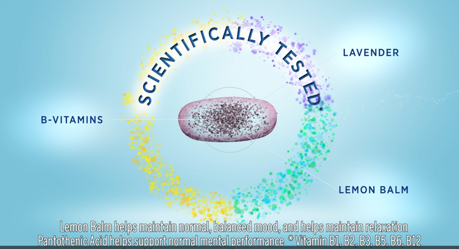
We developed a range of digital and e-commerce assets led by a VOD (video on demand), that captures the universal nature of stress “Life isn’t always straightforward…” and delivers a compelling visual sequence that shows the unique combination of “Scientifically-tested and naturally-sourced ingredients”. It provides evidence and confidence that Nytease will help to keep both mood and mind in balance.
The brandmark has been meticulously calibrated, skilfully preserving consumer recognition with the masterbrand while establishing a new, ownable identity that cues both day and night-time use. And linked to this, our packaging employs bold typography to convey benefits with straight-talking immediacy, cutting through conventional category imagery while reinforcing the notion that this product delivers results.
The use of silver, white, and blue enhances its credibility as a scientifically tested product, while the addition of orange highlights key messaging, ensuring strong shelf presence and visibility.
“Always two steps ahead – ALL Creative anticipated our needs before we’ve even considered them.” Perrigo client
Strategy – Creative – Design – Digital
